Project Case Study
Improving mobile apps for veterans and their doctors

I helped the Veterans Health Administration assess its mobile app usability and overall strategy, then adapted the U.S. Web Design Standards for use in VA mobile apps.
Context
In 2016, VA had a wide variety of mobile apps in development for Veterans and clinicians. These apps were being built by different groups using different user interface patterns, and VA realized that this was not only creating inefficiencies, but also could be confusing for its users. They came to Mad*Pow for help reigning in the user experience, and making sure that the apps were being designed appropriately to meet users’ needs.
Team & Role
I served as design lead on this project, establishing the project scope and schedule for the year-long contract, and then managing a number of scope adjustments as VA’s needs shifted. I was most hands-on in earlier phases of evaluating the apps, and then stepped back to a direction role during most of the design activities – providing guidance, critique, and jumping in to work on UI components as needed. Throughout the year, my team involved two researchers, two UX designers, one visual designer, two developers, one project manager, and one client experience director.
Process
App Portfolio Review
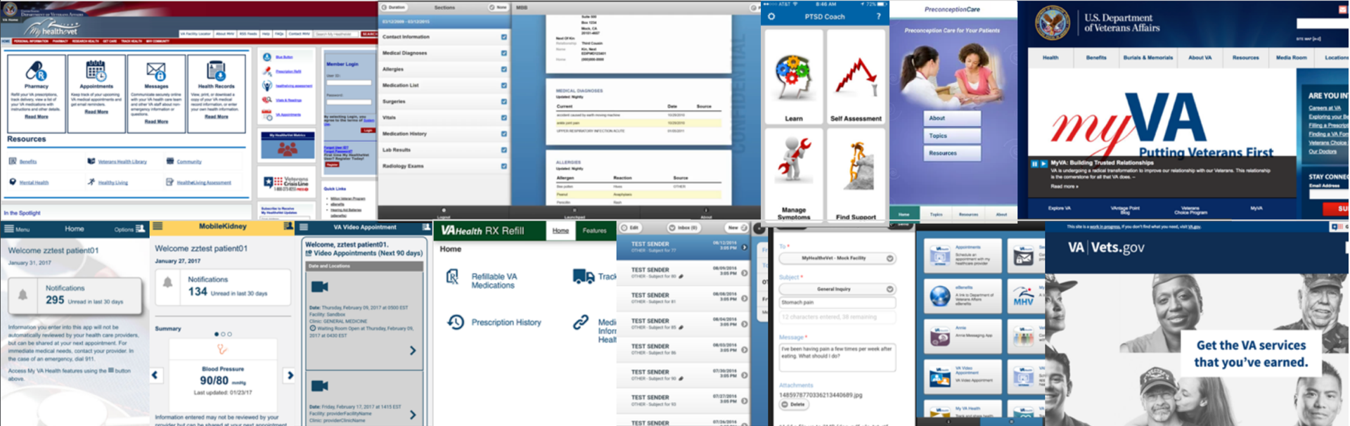
The first step was to wrap our heads around the full set of apps. What was the goal of each app? What audiences were they serving? What functions were common across the apps, and what was unique?
Better understanding the purpose of each app and how it related to the other apps would help us answer the question of how similar or unique the UI for each app should be, and what patterns occurred most frequently.
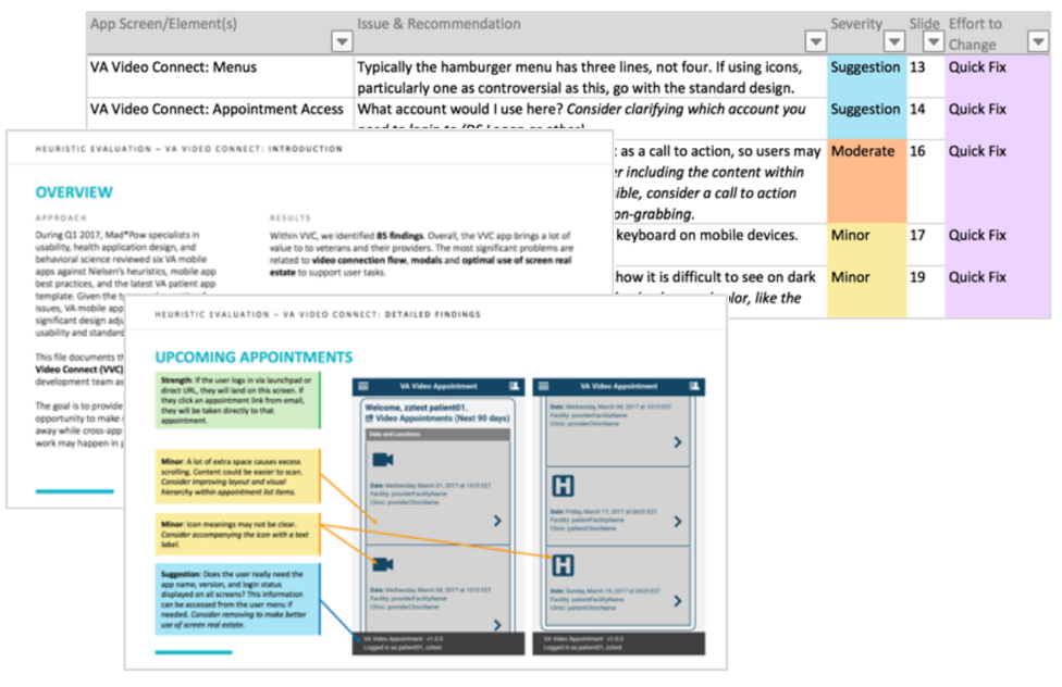
With an understanding of the big picture in hand, we conducted detailed heuristic evaluations of six high-priority apps. This helped us understand what usability issues were most critical to address in the design system.
For each app, we prepared a deck of annotated screenshots and a spreadsheet with issues rated by severity and level of effort so each development team could decide how to filter the work into their backlogs.
User Interviews
Evaluating the apps ourselves was an important starting point that helped us ask the right questions when we got time with users. But in addition to looking at the apps, we absorbed past work by the VA Human Factors team, reviewing their personas, past assessments, and user research studies to get a better sense of context, and identify gaps we could fill with our research rather than repeating work.
Most of the user research the VA team had done so far for mobile apps was focused on each separate app's usability; they hadn't had a chance to look at mobile use, needs, and patterns as a whole across the portfolio. So we decided to split our research time between UI pattern usability and building a better understanding of how Veterans and Clinicians expected to use mobile apps related to VA healthcare.
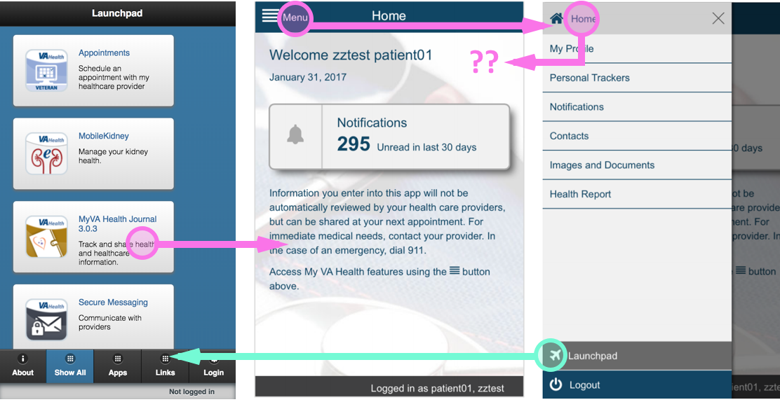
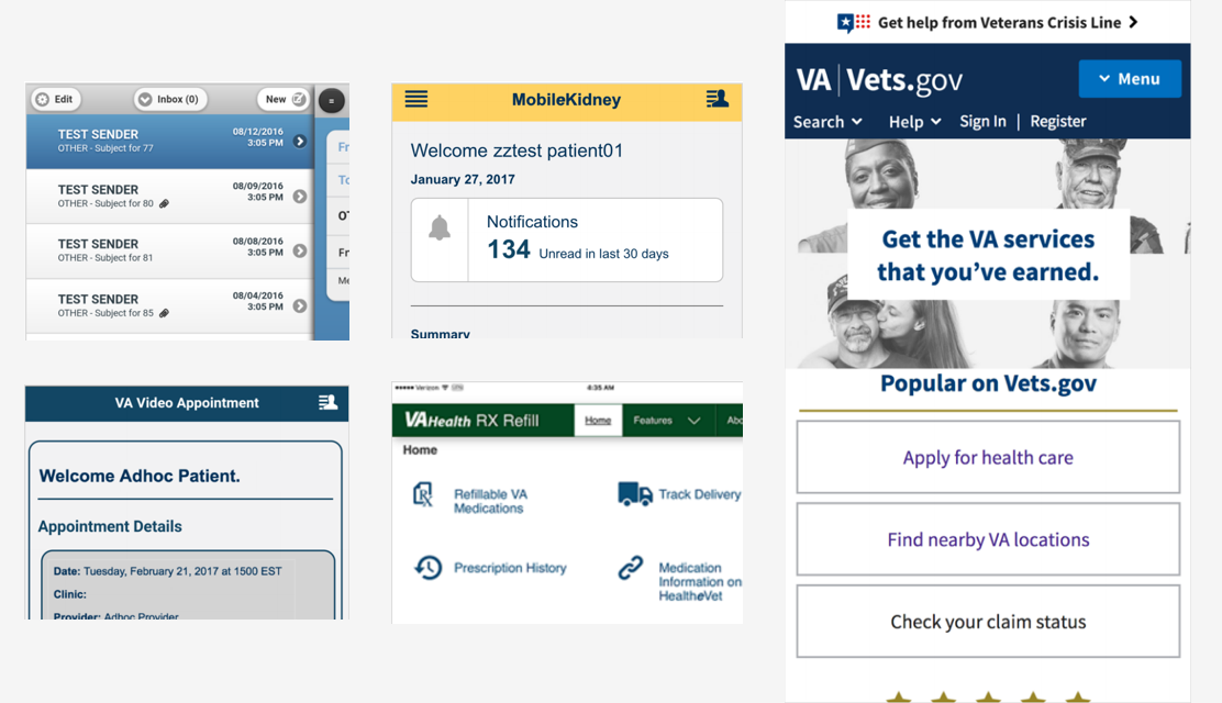
One important usability issue we found was that both Veterans and Clinicians were confused by the navigation pattern used to move between different VA apps.
An app called "Launchpad" simulated a mobile device's home screen, containing the different VA app icons. This seemed fine at first, but when users were instructed to get back to that screen to find a different app, they consistently had difficulty.
“You have two homes...Launchpad isn’t the most intuitive thing”Veteran
“Had no idea what it was going to ‘launch’...Launchpad means nothing to me”Veteran
“I don't know if this is the home screen or not”Veteran
While this is something that could be learned over time, the 'app-within-an-app' felt unintuitive enough that we recommended removing the extra app and term, replacing it with a "Switch Apps" menu where multiple apps were necessary.
This finding connected with the more strategic question of whether the various features actually made sense divided across multiple apps.
VA had created separate apps for appointment scheduling, pharmacy refills, medical records viewing, secure messaging, and a variety of other tasks. Their intent was to keep each app focused and simple. It also helped them divide and conquer the work across different development teams.
But the Veterans we spoke with generally expected these features to co-exist inside a single app they could use to interact with their VA healthcare.
When a service organization such as a hospital or insurance company creates a mobile app, I think it’s important to identify the core tasks are most important to the majority of users, and what might be more tangential. These core tasks should typically be the heart of the organization's flagship service app.

Clinicians, on the other hand, were more open to using a few different apps since they are on-the-job and have a variety of highly specialized tasks that they need to complete many times per day. However, it was essential for those apps to use one persistant login, be interoperable with the main medical record system, and be highly tailored to their existing workflows and mental models.
“I can see the benefit of having everything in one place, but also, less is more for apps. It could lead to confusion if one app did too much.”Clinician
“So many systems we have to log into... people are kinda fed up with that right now.”Clinician
“Every additional click is an additional nick on physicians’ morale.”Clinician, quoting a JAMA editorial
Summary Recommendations
With over 400 findings across the 6 heuristic evaluations, and even more insights from the user research sessions, there was a lot of detail to manage and discuss. I distilled our observations into themes that we could discuss with program leadership and use to guide the rest of our work.
We highlighted a number of information architecture and strategic issues – such as the feature fragmentation described above – and recommended potential short-term and long-term solutions. These were valuable findings, but a little off track from our original purpose, so we also presented more tactical themes to explain what our focus would be for the second half of the project.
One such tactical theme was:
Visual Hierarchy, Organization, and Neatness: Visual elements should support usability, and draw attention to actions the user can take
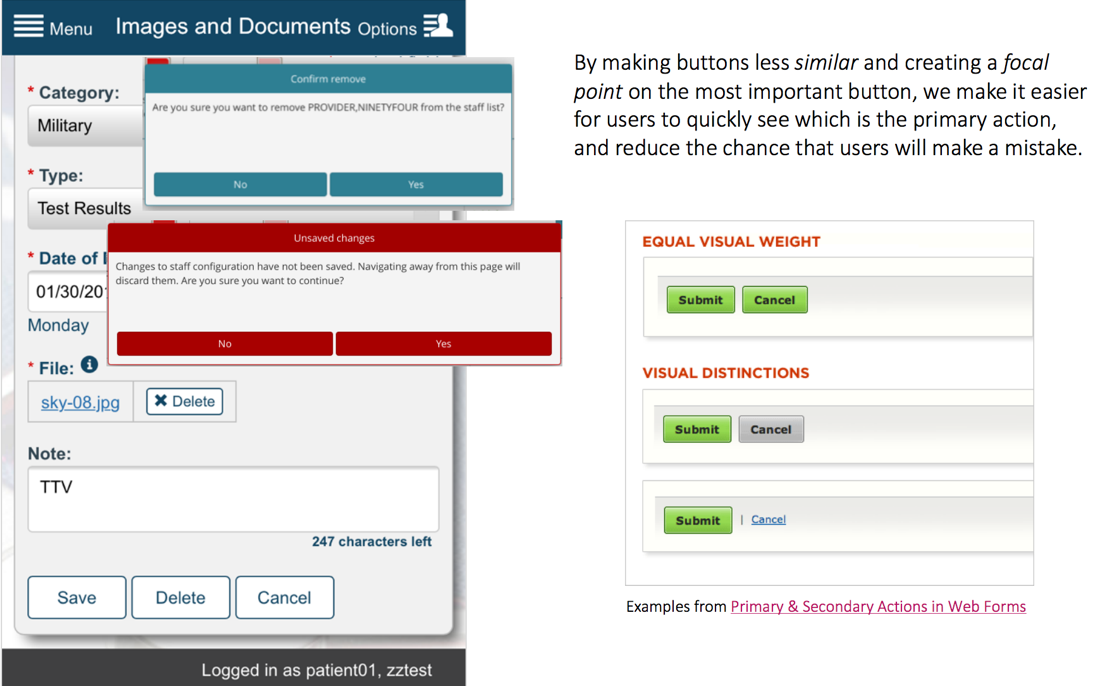
Overall, we saw many inconsistent interaction patterns and different visual schemes that can cause cognitive burden and uncertainty across apps. Consistent design elements could help users feel comfortable and confident they are using an official VA app, and mitigate learning curve for users of multiple apps.
Instead of creating its own unique design system, we recommended that VA should leverage the US Web Design Standards (USWDS). At the time, the standards were being adopted by a variety of government web properties, including the new Vets.gov web portal. Visually, they were an appropriate next evolution of VA’s digital brand.
However, the standards were focused on website components, so our next step was to adapt them to include components appropriate for mobile apps.
Adapting the USWDS
I divided the remainder of our time into 2-week sprints, and I organized the necessary design system elements into sprints based on priority, dependencies, and level of effort.
This allowed us to divide and conquer across a few designers, as different members of the team had different strengths and amounts of time to contribute to the project. We designers typically 'sprinted ahead', preparing any design direction for components in the week prior to the development sprint starting.
Collaboration on this project was one of the smoothest I've ever had on a project where multiple designers are jumping in and out of the work. I think these are some of the main reasons:
- The USWDS provided a firm starting point for colors, type hierarchy, and basic elements, so there wasn't any of the creative churn that often comes in the beginning of defining a design system.
- We had a clear set of UI pattern priorities based on the research and evaluation phase of the project.
- Our toolbox of Jira, Slack, Sketch, Dropbox, Zeplin, and Fractal made it easy to see and discuss the current status of each element.
- And most of all – my team of designers and developers all had great expertise but also great humility and positive attitudes. This led to insightful questions and discussions that gave us a firm rationale for every decision in the design system.
Along with the coded component library, we delivered written documentation on best practices and key aspects of each component that will be integrated into the VA human factors team's UX guide.


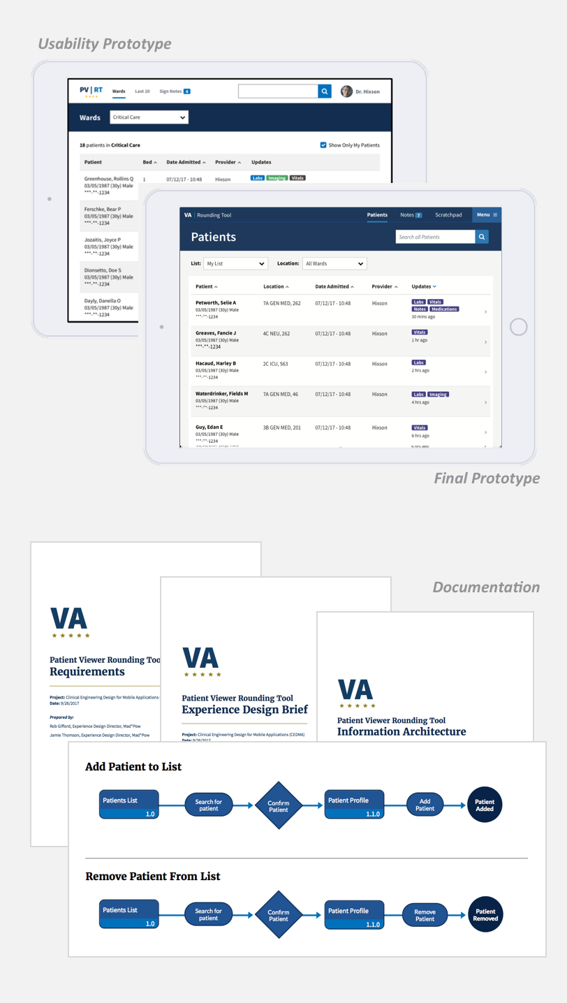
Sample App Prototype
Having worked on design systems for a few clients, I made sure we had the opportunity not just to provide a library of components, but also to show those components used in an example app. This is an important step to make sure designers and developers can see how the components are intended to fit together, and it also helps us ‘check our work’ as we go to make sure what we’re designing works in context.
This work happened in parallel with the design system sprints. Mad*Pow designers Gabe Schervish and Rob Gifford did most of the legwork here, while I mostly served as a sounding board and reviewer.
We collaborated with three VA physicians to define the application flow and create a prototype. Then, we conducted remote usability testing with inpatient physicians and residents from different VA locations across the country.
After testing, we made some revisions to the prototype and packaged it up with some documentation:
- Experience Brief – Summary of the app's objectives, target users, scenarios, highlighted insights and design decisions from research, and next steps in continuing the work.
- Information Architecture – App map and user flow diagrams.
- Requirements – User stories and details of different interactive states and values of form fields.
Outcomes
The ultimate fate of this effort is in the hands of VA and its development teams. We did our best to set them up for success, giving them the tools they needed to improve their entire portfolio of apps. They were very pleased with the work delivered.
I'm particularly proud that we convinced them to use the USWDS – it's tempting as a creative agency to want to create something new, but there was no need to reinvent the wheel when we could instead help promote usable, consistent, efficient design across government websites and apps.
Additionally, we steered the year-long project in on-time and on-budget, which is a particular achievement for government contracts.
 Empowering women to make informed childbirth decisions
 Building a virtual clinic to connect patients & clinicians 24/7