Project Case Study
Health engagement & customer service apps for a virtual clinic

I helped Dartmouth-Hitchcock build a mobile health service from the ground up that successfully reduced hospital admissions and cost of care while earning a 95% customer satisfaction rate.
Context
Dartmouth-Hitchcock is an academic medical center and regional health system headquartered in New Hampshire. As a leader in population health management and value-driven, evidence-based care, they recognised an opportunity for new technologies to help them better serve patients, particularly across rural areas of the region.
“Imagine this... Creating a hospital that doesn’t want people to visit. Not because we don’t care – but because we do. Imagine a hospital that believes healthcare doesn’t just mean treating sickness. It means caring about our patients enough to keep them from getting sick in the first place.” Dartmouth-Hitchcock’s vision of a sustainable health system [ YouTube ]
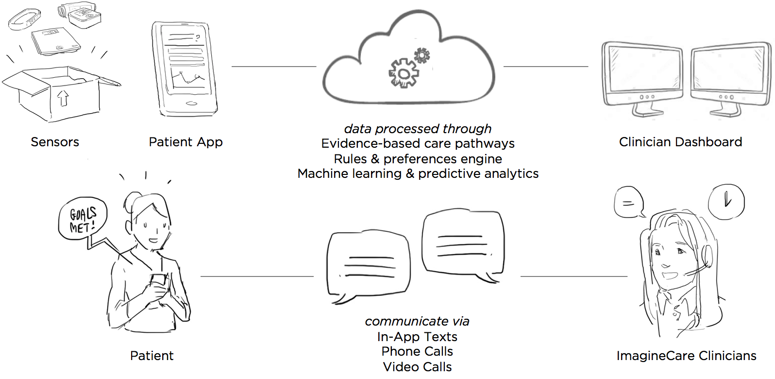
With this vision in mind, Dartmouth-Hitchcock founded ImagineCare – a start-up with the mission to create a truly proactive, human-centered service that supports people beyond the hospital walls, whenever and wherever they might need care.
Team & Role
ImagineCare partnered with Mad*Pow and Microsoft to build a custom technology platform. Microsoft brought to the table their Azure cloud services, CRM software, and machine learning capabilities. Our team at Mad*Pow provided web and mobile app development, human-centered design leadership, and deep expertise in healthcare service design.
I was the lead designer on this project, executing most UX research and design activities myself, directing visual designers on the UI design, and collaborating with developers and product managers to bring the service to life. Our goal was to build a minimum viable product that could be pilot-tested to see whether the service impacted health and financial outcomes. I was involved with the project for about a year. Early design work kicked off in January 2015, and the pilot took place in mid-2016.
Process
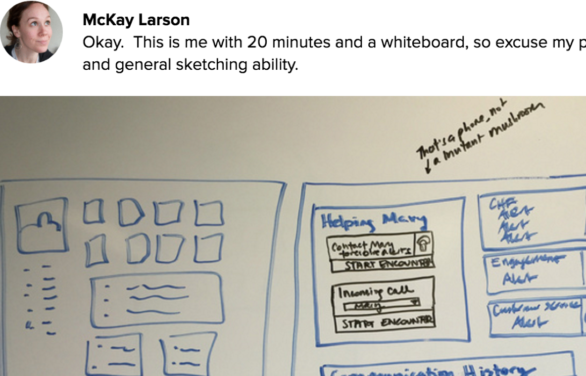
Interviews & Kickoff Workshop
The ImagineCare team had great ideas and strong clinical expertise, but they needed help determining how customers and clinicians would interact via the service – what it would look like, how it would flow.
Normally I would start a project like this with exploratory user interviews to look for opportunities, pain points, and unmet needs. But between Mad*Pow and Dartmouth-Hitchcock, our team had extensive past experience with the problems at hand. So instead, we decided to create something tangible that we could get in front of users as soon as possible.
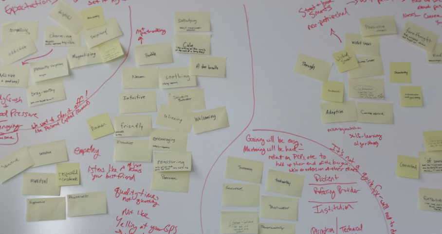
After conducting stakeholder interviews with the ImagineCare team, I faciliated a design workshop to help everyone get on the same page and start visualising their ideas. Design isn’t just for ‘the designers’ – it’s something everyone takes part in. ImagineCare clinicians, product managers, and executive leadership all participated in this session (and had a lot of fun, too).
In addition to early screen concepts, the workshop and interviews provided a firm foundation of principles that guided our work – from early exploration through narrowing in on the minimum viable product for launch. Two of my favorites were:
“Be a great listener – respectful, present, empathetic, friendly, humble”
“Build and maintain trust – both in perception and the technical reality – across customers, clients, and people’s medical neighborhoods”
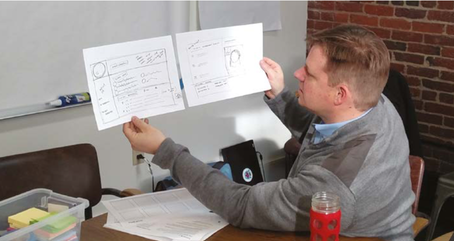
Early Mockups
Following the workshop, I took our pile of sketches and started wireframing. These are some early ideas for home screen. I considered a few key questions – When and why are they coming into the app? What do we want them to know and/or feel? I considered the “stuff” that we might be able to surface to the user – devices, detailed data, tasks, health status.

The team and I assessed these ideas against our principles and the possible scenarios for how someone might enter the app.
Since much of the tracking in ImagineCare is passive, we decided to focus on health status while also highlighting any active tracking tasks that needed attention.
We wracked our brains for a good name for this home screen tab, and settled on the “Health Monitor” – it’s kind of a weird name, but in testing with users it seemed to make the most sense – it’s direct, says what it is. A way to monitor your health.

Concept Testing
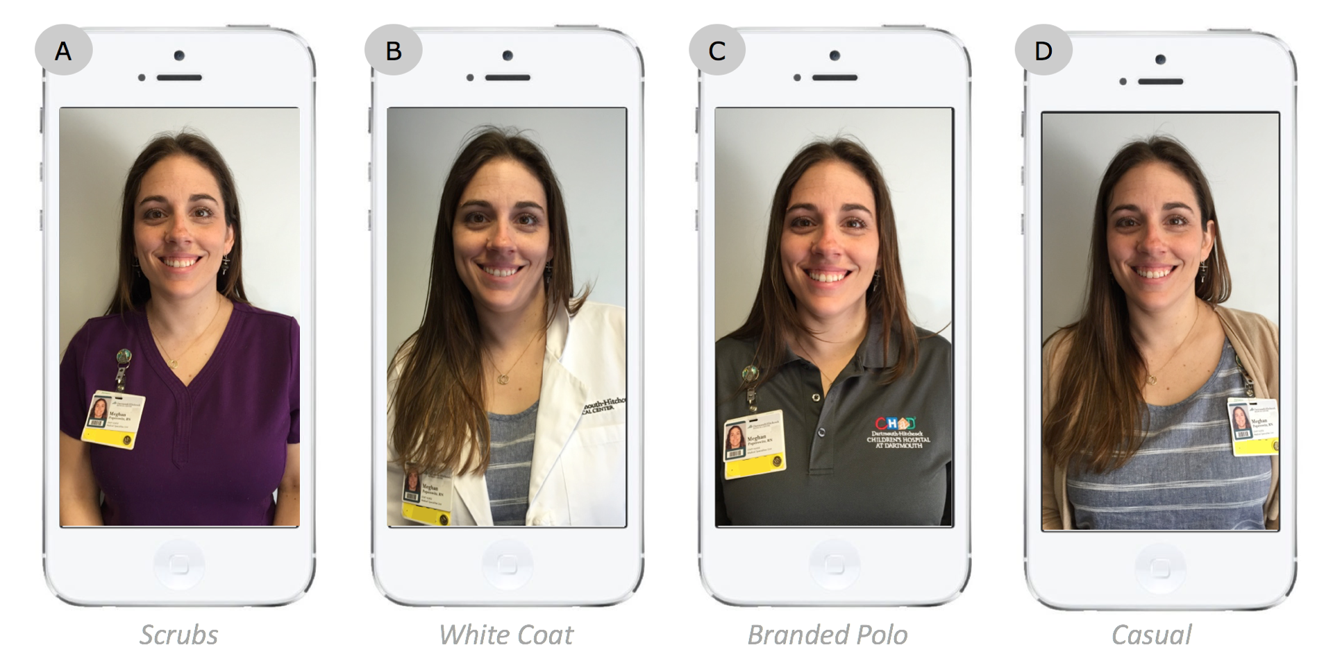
We created a variety of screen mockups and storyboards that could be used both to help communicate the idea within Dartmouth-Hitchcock, and for concept testing with 10 potential ImagineCare users. We showed them storyboards that explained how the service would play out, asking probing questions to understand their reaction to the service as a whole and how they felt about small-yet-important nuances.

One of the most unique things we tested was what type of clothing customers might expect to see when videochatting with a Registered Nurse versus a less clinical ‘Health Navigator.’ The team had been leaning toward a more casual look since ImagineCare has a friendly, personal culture, but users said they would expect nurses to wear the scrubs or white coat since they represent authority.
We also tested sample chat interactions. The live qualitative research interviews were critical to understanding why people felt the way they did about different nuances.

One of the major findings from this activity was that participants strongly preferred messages with a human photo and name – these brought a greater sense of care and accountability.
We debated using automated messages that appeared to come from a human. However, back to our trust-building design principle, the ImagineCare team had a strong desire to always be authentic with its users. Human staff would chime in as much as possible to ensure users felt cared for, and we settled on the ‘ImagineCare Team’ bot as the purveyor of automated messages. With a single stream of conversation between ImagineCare and the user, different staff members and the bot could jump in and out as needed amidst the logistical realities of running a 24/7 care center.
Mobile App Design Refinement
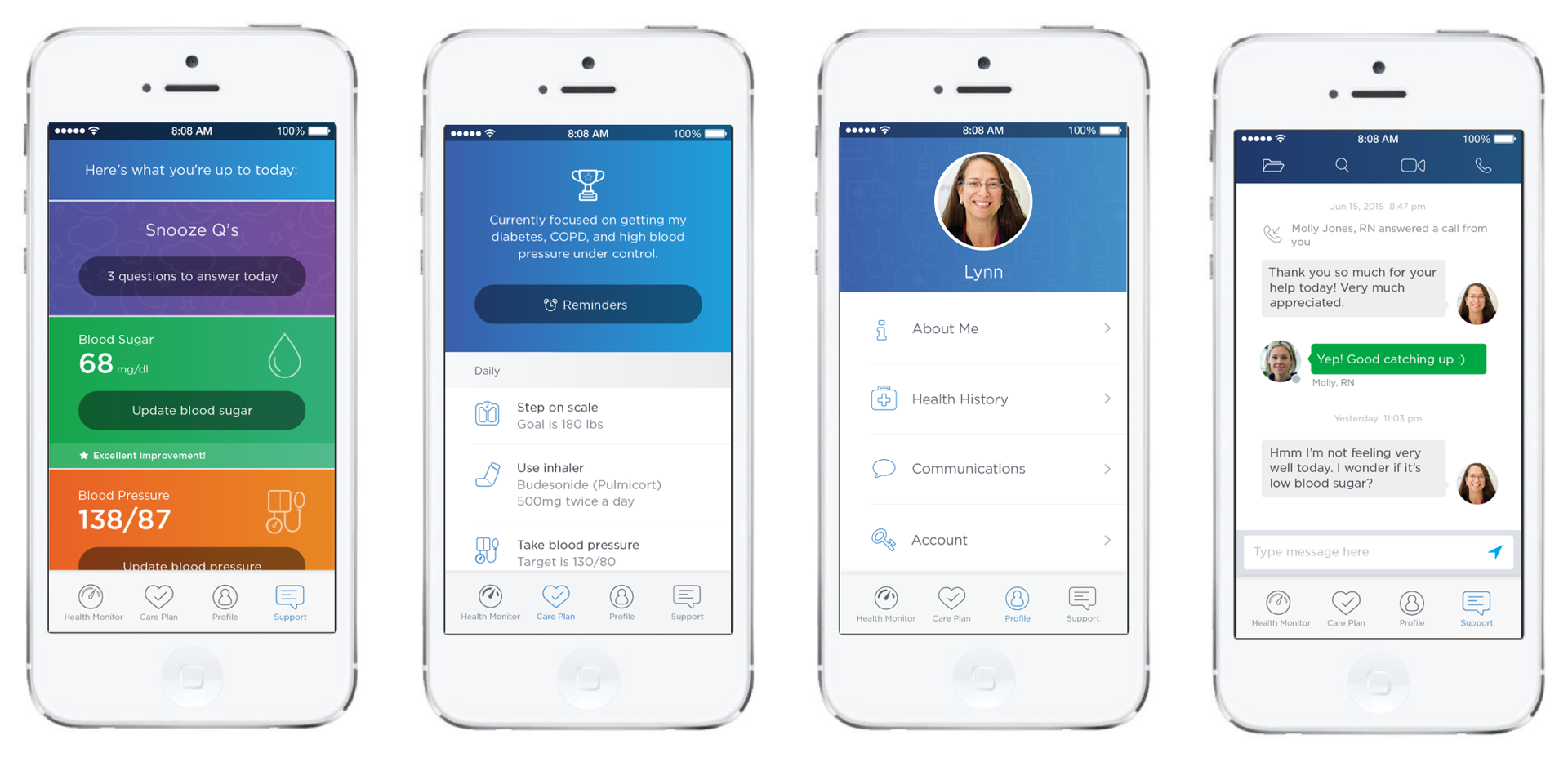
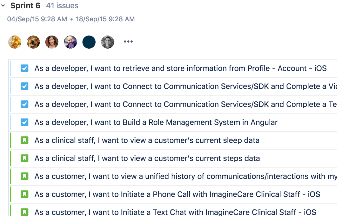
With a hearty set of research findings in hand, my team and I made some refinements and finished designing the full set of screens and flows within the app. The full feature set included:
- Enrollment (web-based form)
- iOS App & Bluetooth Sensor Setup
- Active Tracking - Weight, Blood Pressure, Blood Sugar, Daily Questions
- Passive Tracking - Inhaler Use, Activity, Sleep, Behavioral
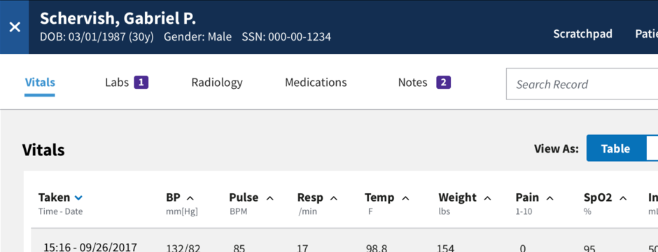
- Data Visualization for all vitals
- Communications with ImagineCare Clinicians - Chat, Phone, Video
- Care Plan & Goal Setting
- Reminders & Notifications
- User Profile - Health History, Personal Info, Communication Preferences, Account Settings
Clinician Dashboard Design
At the core of ImagineCare is this idea of forming authentic personal relationships – understanding the whole person enables the ImagineCare clinicians suggest realistic strategies to help patients take control of their health.
So we needed to go beyond just the medical data, to things like stressors and favorite sports teams. With so much data to manage, we needed to have a clear sense of priority to prevent the patient record from becoming too overwhelming or difficult to use.
I worked closely with the nurses of ImagineCare to co-design a web app that looked very different from a typical EHR. They wanted something they could sit in front of and be engaged with for 8 hours a day, something with the personality of the ImagineCare staff, and something that emphasized the humanity of the people they would care for.
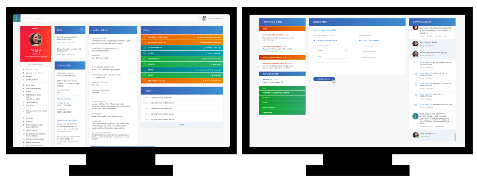
We were fortunate enough to work with a pre-defined hardware setup that the ImagineCare call center would have – two monitors, side by side – so refreshing in the era of cross-platform responsive design!
Implementation
Throughout the entire design process the development team had been involved, but we still needed to codify the details in flows, functional annotations, and data models.
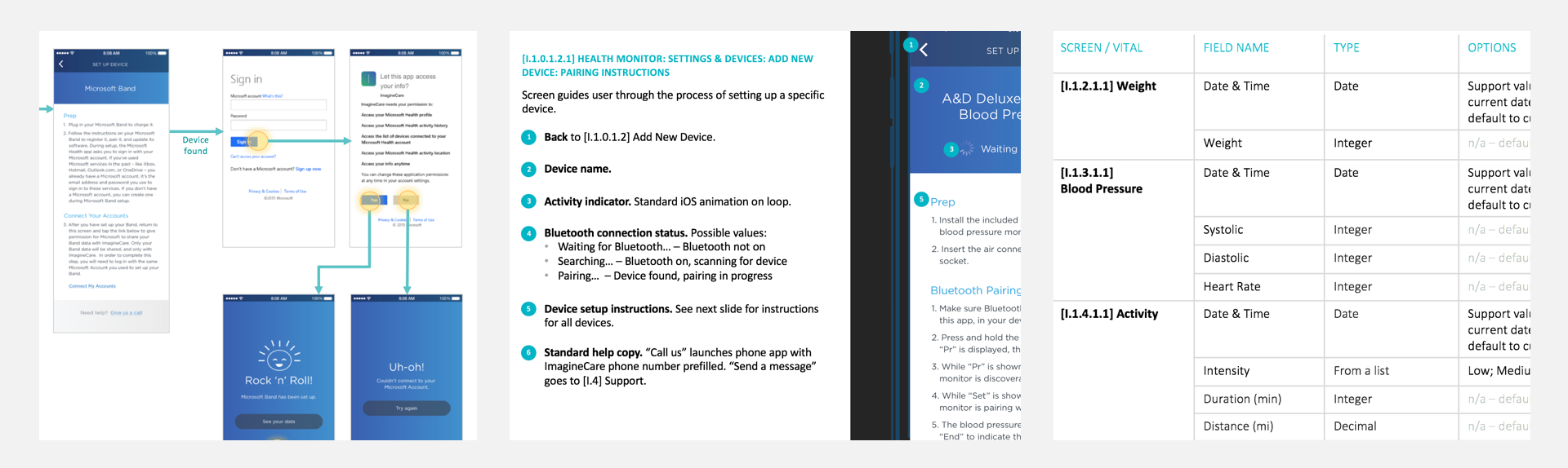
We also needed to reign in some of our ideas to make sure the minimum viable product was realistic in scope. We started by working toward a "friends and family beta" focused on the tracking features for initial user feedback and stress testing. Since ImagineCare relies on passive tracking and quick touchpoints of interaction, it was important to get the app out in the real world to see how it was working within the context of users' lives, from both a usability and technology standpoint.
After the beta, we continued building toward the full feature set for a pilot launch. I provided continual support to the development team in discussing the design details and rationale, working through edge cases, and finding workarounds when technical limitations came up.
Outcomes

More than 2,700 customers enrolled in the 2016 pilot. The ImagineCare clinician services received a 95 percent satisfaction rate from customers, and the program engagement was four times the national average for employer health and wellness programs (Towers-Watson 2013/2014 Staying@Work survey).
Individual customers with hypertension experienced a 50% reduction in poorly controlled blood pressure.
Compared with a matched control group, the pilot population saw:
- 56% reduction in hospital admissions
- 23% reduction in emergency room costs
- 6% reduction in avoidable emergency room visits
- $255 savings in total cost of care per member per month
Of course, the numbers are great, but it’s the qualitative feedback from users that I’m most proud of.
“I remember struggling to get 10,000 steps each day, watching my heart rate increase with each round of 1,000 steps ... my heart is grateful for everything you have given it.” Pilot participant
“I owe a debt to ImagineCare and am so appreciative of the experience and interactions I have had with your team. You have... quite literally... helped change my life. Thank you for everything!” Pilot participant
In 2017, Dartmouth-Hitchcock spun ImagineCare off as a stand-alone venture. It was then purchased by Swedish healthcare company LifecareX, which is continuing ImagineCare's development and conducting further pilot studies.
Related Talks & Publications
For more on this project, particularly the behavior change aspects, see also:
-
Achieving Better Health Through a Balance of Technology & Human Touch
Nov 2017 – Service Design Network Health Sector Impact Report
-
ImagineCare: Empowering Patients with Behavioral Science and Technology
Feb 2017 – Boston CHI Meetup
-
Designing ImagineCare: A human solution, enabled by technology
Apr 2016 – HxRefactored
 Improving mobile apps for veterans and their doctors
 Empowering women to make informed childbirth decisions