Project Case Study
Empowering women to make informed childbirth decisions
I designed an interactive decision aid to help mothers understand the medical evidence around their options during pregnancy and childbirth.
Context
In 2011, the rates of C-sections, maternal death, and other childbirth complications were on the rise, and two nonprofits – the Informed Medical Decisions Foundation (IMDF) and Childbirth Connection – partnered to find a way to make an impact on the statistics. They came to Mad*Pow for help in defining an intervention strategy and designing an engaging solution that would equip and empower women to make shared decisions with their doctors.
Team & Role
This was my first project at Mad*Pow, but it remains one of my favorites because the clients and subject matter were so inspiring. It also shows how from day 1 at Mad*Pow I was providing value – I started out providing research support for team leads Megan Grocki and Dan Berlin, but my role quickly expanded to include design studio facilitation, journey mapping, strategy documentation, prototyping, visual design collaboration, and development documentation.
Process
Research
Though our clients had in-depth knowledge of the maternity space, we needed to immerse ourselves too, so we could understand the medical realities of childbirth as well as the personal journey each woman travels. Foundational activities included:
- Market scan review 10 of the leading pregnancy websites and mobile apps to identify gaps and opportunities
- Interviews with 10 world-renowned women’s health professionals to better understand maternity care
- Interviews with 16 women about their experiences with pregnancy and how the Internet helped their decision making
- Survey of 2000+ women online for a broader, quantitative data set
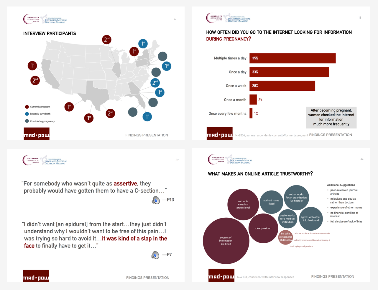
Pregnancy is a huge, often overwhelming learning experience. Our data showed that though most women were going online frequently looking for answers, everyone has a different tolerance level for information:
“Some of my friends took birthing classes to learn about all the variables and choices, and they said in hindsight they didn’t need it—it’s either scary or just too much.”– Interview participant
“Getting to learn that my options in labor aren’t as narrow as ‘go to hospital, bend over, take whatever they say to take because they know better’ was very freeing and enlightening.”– Survey participant
An important design principle that I drew out of this research was, “Promote awareness of choice without overwhelming.”
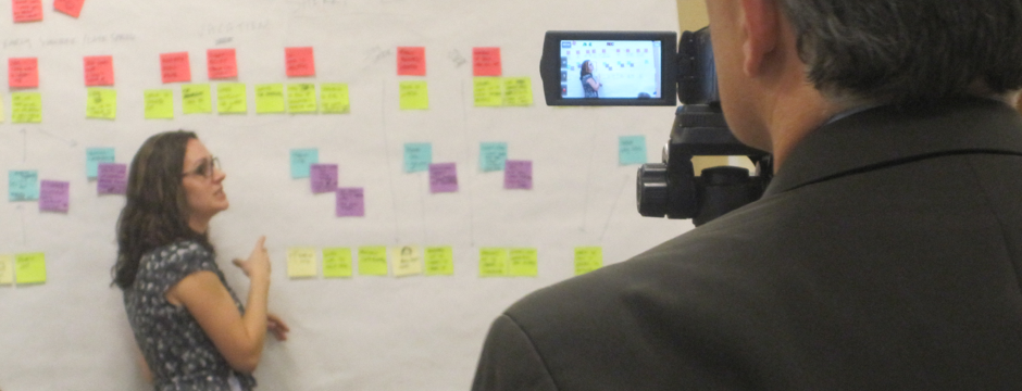
Personas, Journey Mapping & Strategy
Fully marinated in insights, I distilled the patterns in our research into four personas. Each persona had a journey narrative that depicted a present-day story, and a future story where the user encountered our solution. I designed these documents to be more narrative-based than a typical journey map to make sure I was capturing the level of detail the team needed – both in terms of design concepts and the emotional value of the stories we heard during research. This format also helped us collaborate more directly with our expert clients, as they could edit the Word Document directly.

The journeys referenced parts of the broader consumer engagement strategy report we prepared to capture design concepts that we'd sketched with the client, and the broader goals, brand identity, and engagement tactics for the solution.

Prototyping
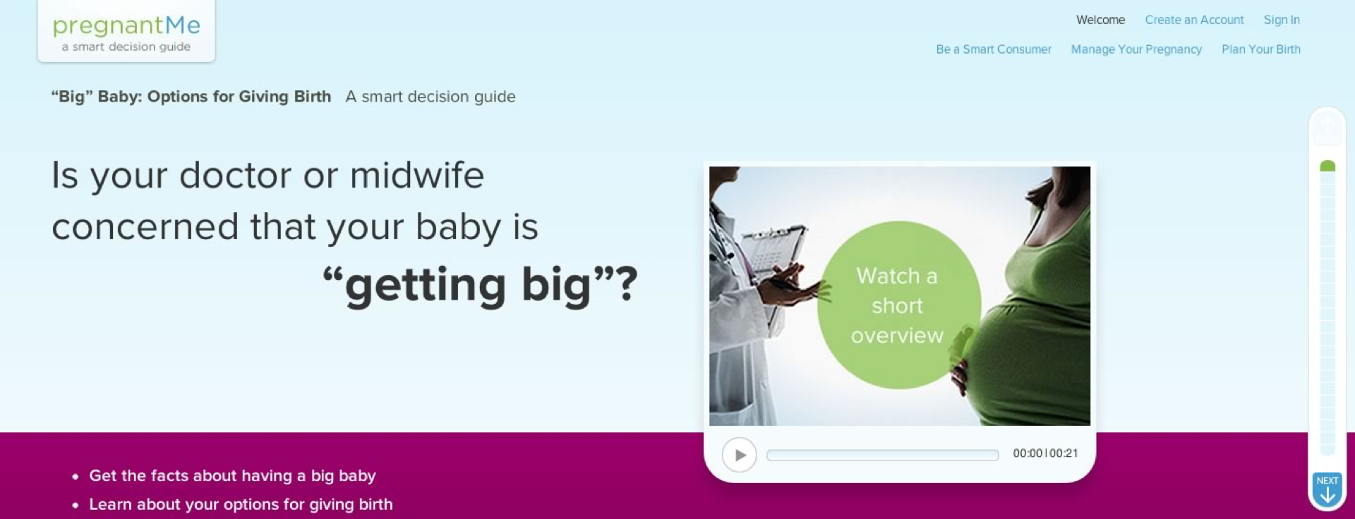
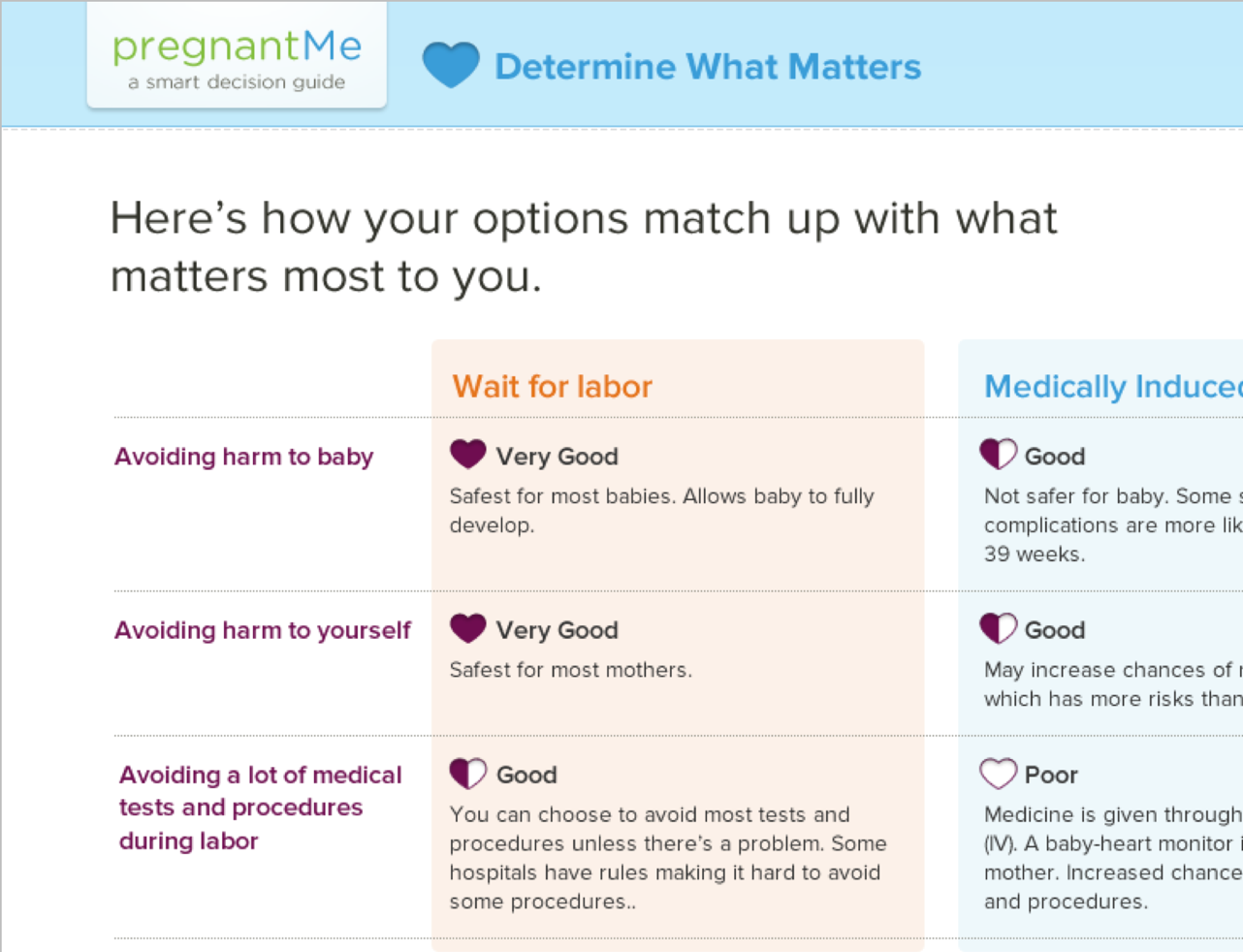
While the solution would ultimately be a website, the most important part to get right was the decision aid template, which would help a woman walk through one specific decision to understand the options and medical evidence, reflect on her priorities, and prepare to discuss it with her doctor or midwife.
I wanted the movement from one step in the decision aid to the next to be as frictionless as possible, so my prototype was a single page with sections that expanded down as the user progressed through the different activities.

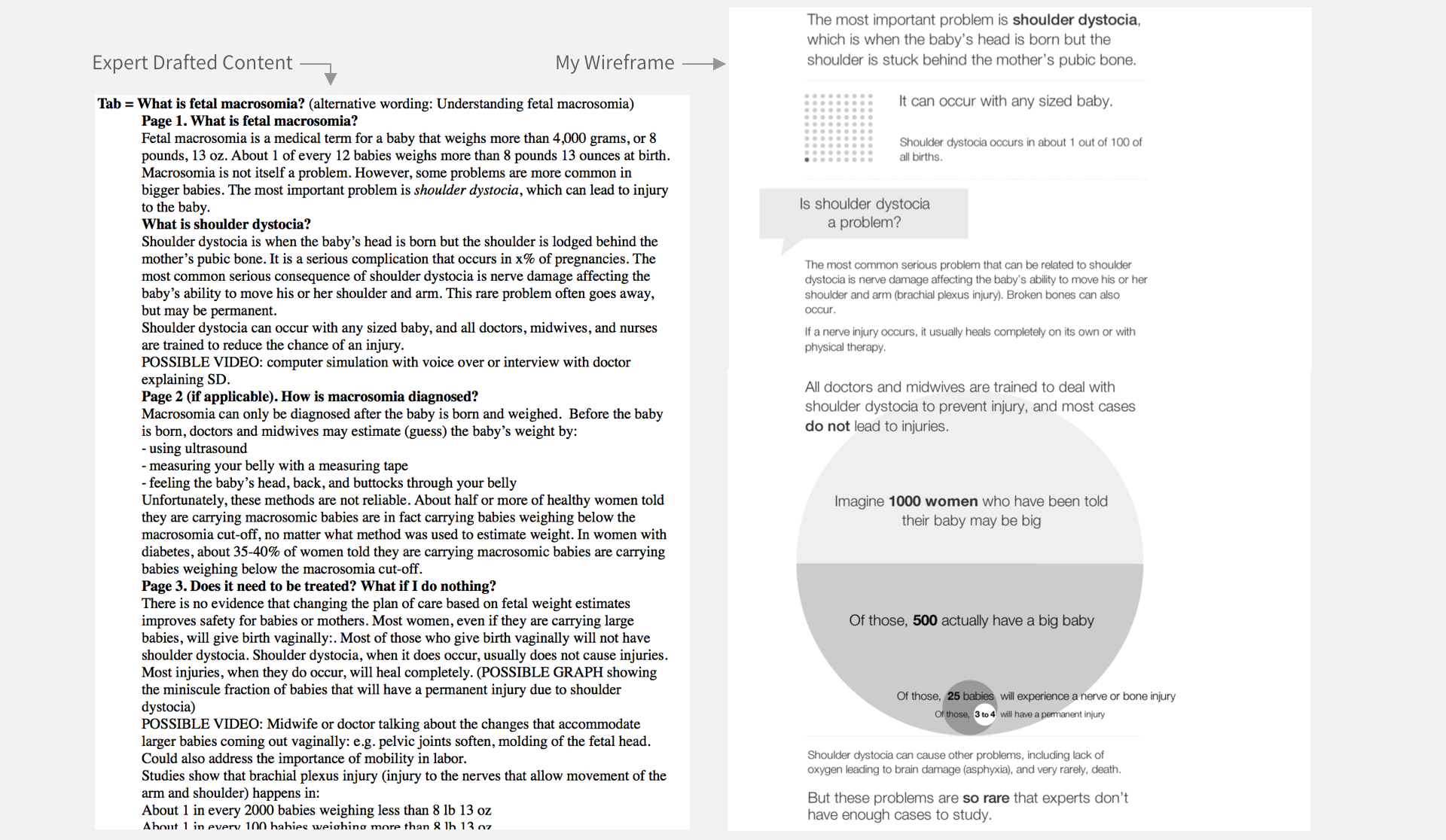
I collaborated closely with the client team as they drafted content, helping them break up dense scientific text into more scannable chunks, infographics, and interactive features.
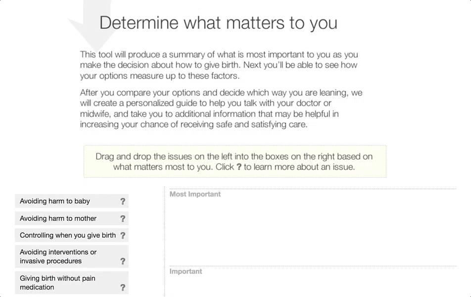
Being able to compare options in a grid was an important idea that came up early in our discussions and sketches, but we wanted to go beyond a generic pre-formatted grid.
I designed a drag-and-drop activity where the user could reflect on her birth experience priorities and receive a personalized comparison grid. This helped women pause and ask questions of themselves that they might not have otherwise.
Testing & Refinement
During usability testing on the wireframe prototype, we got a lot of positive feedback on the concept, and identified a few areas to make the experience smoother.
In parallel to the UX strategy and design efforts, our visual design team had been working on naming and branding for the site. After usability testing, I worked with them to apply the visual style. We generated comps and specs that were coded into another prototype for another round of testing and revision.
Outcomes
The IMDF and CBC team shared the prototype and engagement strategy at their annual conference of senior medical editors, sparking excitement and energy around the opportunity to transform maternity care:
“An exciting interactive approach”
“Very impressive interactivity and personalization features”
“The graphic design and organizational flow was outstanding”
Additionally, our clients were very pleased:
“The Mad*Pow team’s very unique approach and methods to facilitate two-way client engagement worked really well for us in our strategic planning and design phases. We started with a great idea and aspirational goals and they guided us through the process of defining a plan that emphasized the value we could bring our audiences through our unique position in the market. Thoughtfully and iteratively they created a detailed strategy that propelled us to the next level.” — Molly Beinfeld, IMDF Director of Independent Production
Sadly, the solution was never released to the public. Soon after the project ended, IMDF merged with Healthwise; PregnantMe was folded into their private solutions for health plans, hospitals, and care management companies.
Related Talks & Publications
After working on this project and a few others involving journey mapping, I shared what I'd learned with the broader UX community. Journey maps are a little old-hat now, but back in 2012, they were just picking up steam in the field.
-
Customer Journeys: Not Just Another Deliverable
Mar 2012 – IA Summit New Orleans
-
Illustrating the Big Picture: Journeys, Experiences and Interactions
Jun 2012 – UX Magazine
 Inspiring a health insurance company’s vision for better customer experience
 Building a virtual clinic to connect patients & clinicians 24/7