Project Case Study
Designing streamlined dashboards for managing an $8bn philanthropic budget
I helped reduce duplicative, manual work and reporting inconsistencies across the Gates Foundation's 40+ grant making teams
Context
The Gates Foundation is a philanthropic organization that works to dramatically reduce disease and poverty and build a more equal world. As of 2024, the foundation's annual charitable support reached US$8 billion, enabling innovative ways of improving the greatest number of lives around the globe.
You might assume giving away money is easy, but it's quite complex when balancing the goals of 40+ program teams with 1,000+ strategic bodies of work spanning global health, development, education, and more. The organization also has to navigate important charitable regulations, getting a specific percentage of funds out the door each year while doing appropriate due diligence to make grants to organizations based in 100+ countries.
Stewardship of the foundation's funds is a massive responsibility, and I am grateful to have had the opportunity to shape the tools that help teams manage these funds day-to-day.
Background & My Role
I was initially brought into the foundation for my expertise in design systems and data visualization.
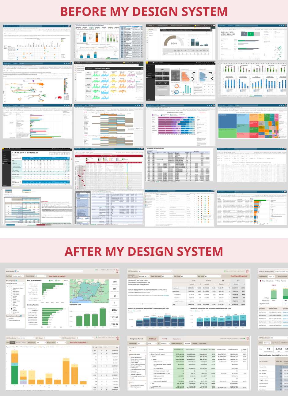
Leaders were frustrated by highly varied financial summary views across the foundation's 40+ grantmaking teams, rife with readability issues and different layouts and styles, leading to high cognitive load, inefficiencies, and occasional misunderstandings for those who look across teams.Additionally, foundation IT was in the process of standing up Microsoft Power BI as the new primary enterprise BI tool, alongside a new enterprise data warehouse – a great moment to implement a design system.
But I was hearing a migration to Power BI might be a tough sell, as users had many well-loved homegrown tools across Tableau, Excel, SSRS, and even custom HTML dashboards.
So, alongside initial work on the design system and a few in-flight reports, I advocated for upfront user research to understand the landscape, and received approval from my IT sponsors to proceed.
Process
Discovery Research
I conducted a mixed methods study of 11 baseline usability sessions and 15 "show-and-tell"-style contextual inquiry sessions to explore people's existing workflows and tools.
I targeted my recruiting by looking at usage logs for our legacy data warehouse, identifying a diverse set of high and moderate use staff across teams, roles, and our offices around the world.
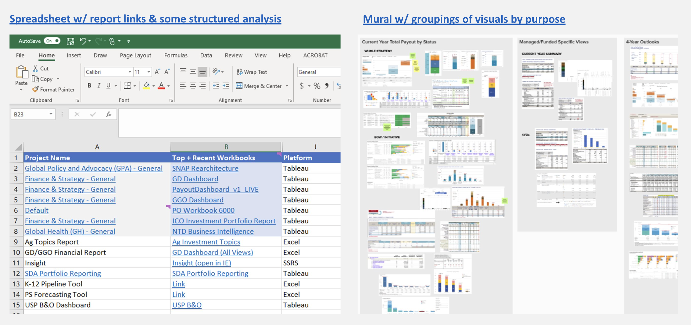
64 discrete data tools were shared across the 15 contextual inquiries. The sessions helped me see a clear gap in the new Power BI reports – users were still heavily reliant on legacy tools for pipeline reporting, a critical business function.
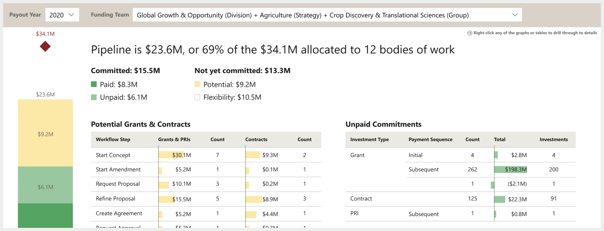
Pipeline views help grantmaking teams see how much of their budget has been disbursed to grantees, how much is committed but not yet paid out, and how much will potentially be committed through grants that are anywhere from an early idea to the final stages of agreement drafting.
This gap was due in part to a new data construct not yet being ready in our new grantmaking system. As the underlying building blocks fell into place, I partnered with 4 colleagues from Enterprise Business Management, a process improvement-focused finance team, to address the need for pipeline reporting built around the new data construct – a strategic and financial planning unit called "Bodies of Work."
My personal goal as the sole UX resource on the project was for the new reporting suite to be so well-loved by users that they'd willingly let go of their legacy tools, easing the eventual retirement of our legacy data warehouse and Tableau financial dashboards.
Visual Audit
With a landscape of ~100 existing tools focused on or adjacent to pipeline reporting, my natural first step was a visual audit.
For me, a visual audit isn't just about the visual elements – it's a form of ethnography that helps me look for patterns and outliers in the information and functionality people have prioritized. This helps me start to infer their goals, motivations, and behaviors: What insights are they seeking? What decisions or actions are they taking from those insights?
During this initial deep-dive, I worked closely with the finance SME who led the creation of the Bodies of Work (BoWs) data construct – building deep understanding of the "old" and "new" ways of working, and the tensions these were causing in the legacy tools.
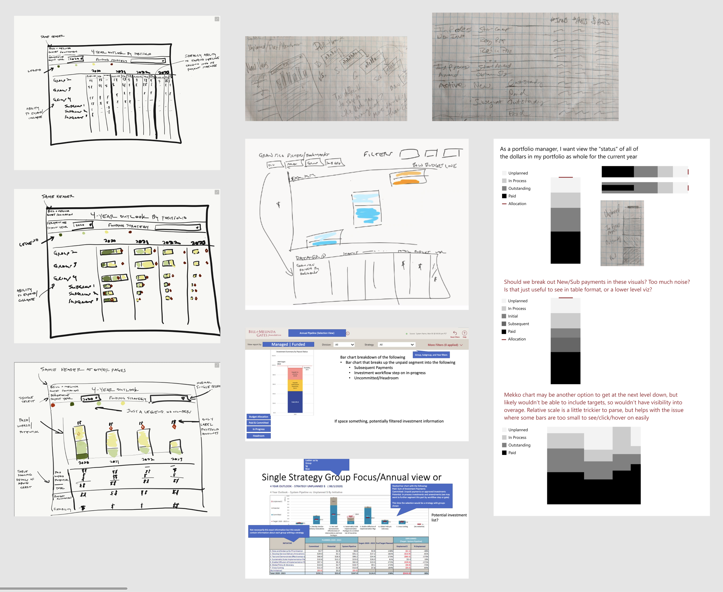
Sketching & Rapid Prototyping
From the audit, I could see a clear pattern of information needs to start distilling into designs we could take to users for early feedback.
But I didn't go it alone – I encouraged my finance collaborators to start sketching some ideas as well.
We brought together our sketches to align on the important elements of an initial prototype, including what data would be required.
I started refining these in Figma, but quickly felt constrained and itching to get into Power BI itself. It was important to work within the constraints of what Power BI could support – spending time exploring custom data visualizations in a design tool would not be a good use of time. It would also be faster to prototype interactivity there, rather than simulating in Figma.
Luckily, our IT business systems analyst was quick to take our data requirements and set up a v1 data model for us in Power BI. Combining that data model with the Power BI template I'd built for our design system, I was able to prototype key design elements with live data.
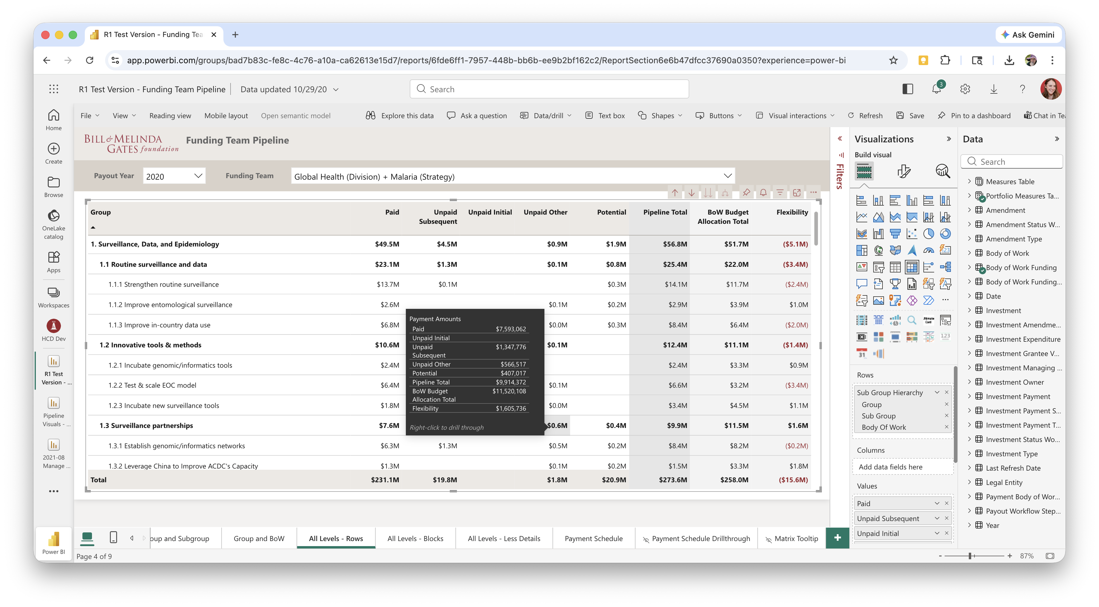
The data wasn't all available yet, and some elements would've taken me longer to depict in Power BI than to draw in Figma, so I mixed-and-matched as needed between Power BI and Figma to depict our vision. I like to stay flexible with my design and prototyping tools and documentation approach – using whatever will be most effective for the team, technology, and time allotted.
Throughout the many agile sprints of design iteration ahead, I maintained an orderly Figma file to ensure our BI development team had a source of truth for what we wanted to be shippable each sprint, as well as notes on what our design goals and user research focus were.
Establishing a User Cohort
Now, how would we test it? Between my goal of developing dashboards users would fall in love with, and the finance team's experience implementing large-scale changes across the organization, we decided to convene a representative "cohort" of users who would join us on the journey to new pipeline reporting.
We selectively invited a diverse, representative group across teams and relevant roles. With a high opt-in rate, we knew we'd have great engagement to drive design iteration over the next few months.
The 34 cohort members would attend a monthly group meeting and be our pool for iterative 1:1 user sessions, surveys, and other design research activities. A typical monthly meeting involved a live demo of the latest iteration, a research study recap or live group research activity, and a look ahead at the next iteration and asks of the group.
In addition to the core user research function, the group meetings had an added benefit of bringing together folks in similar roles on very different teams in a way that let them compare and contrast each others' ways of working. This helped build the belief that common enterprise tools were viable, and perhaps fewer bespoke tools were needed.
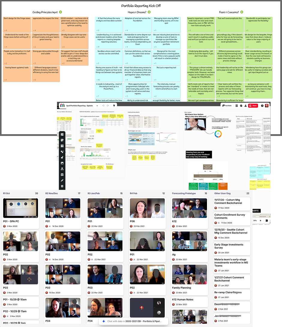
Ultimately, we needed to build trust with users who had not always been well served by central enterprise offerings, while also building trust in the new data warehouse. I took special care to address minority team needs that were critical to adoption and highly impactful across the enterprise for certain teams that operated in a matrixed fashion. To ensure our global office colleagues had a voice in the process, we held two instances of each monthly group meeting – one in the morning, and one in the evening when colleagues based in India and China could reasonably attend.
User feedback from 5 rounds of 1:1 testing, 8 group sessions, and 2 survey activities drove many design decisions as we built out the 20+ dashboard and drill-through detail views needed.
Design Iteration
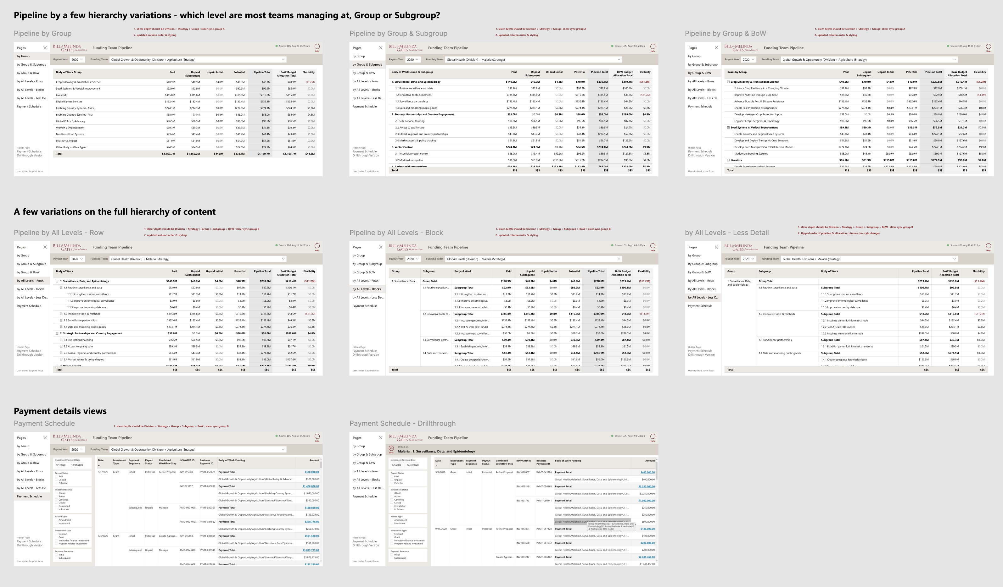
I had learned quickly when starting our design system that tables are the workhorse of financial reporting, and small variations in layout and labeling can have a big impact on people's productivity. So in the first round of design and testing, I focused on tabular views, wanting to get those right before moving on to the "prettier" visualizations.
I moved onto visualizations next. Teams' legacy reports used a variety of color schemes, but the most common was orange for potential investments, blue for unpaid, and green for paid. Paid and unpaid are both committed funds, children of a common parent category, while potential investments are far more uncertain. Rather than maintaining three unrelated hues, I proposed two shades of green for paid (darker for money out the door) and unpaid (lighter for green-lit, but could still slip), and a light yellow for potential.
While green can be problematic for users with colorblindness, I'd previously built our design system palette with substantial tint/shade variation so we weren't relying on hue alone to communicate meaning. Running the scheme through colorblindness simulators confirmed it held up, as did black and white printing. (Our staff were known to print documents when traveling or preparing for big meetings.)
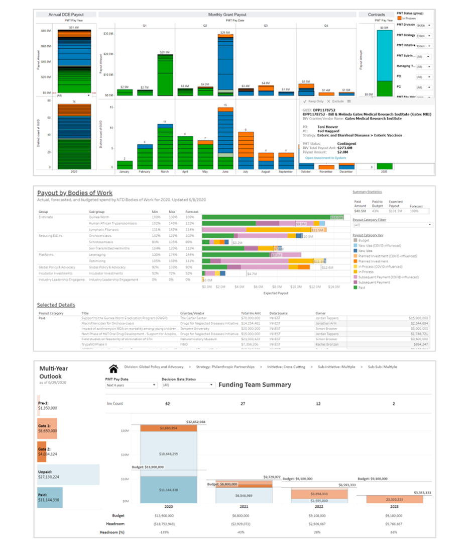
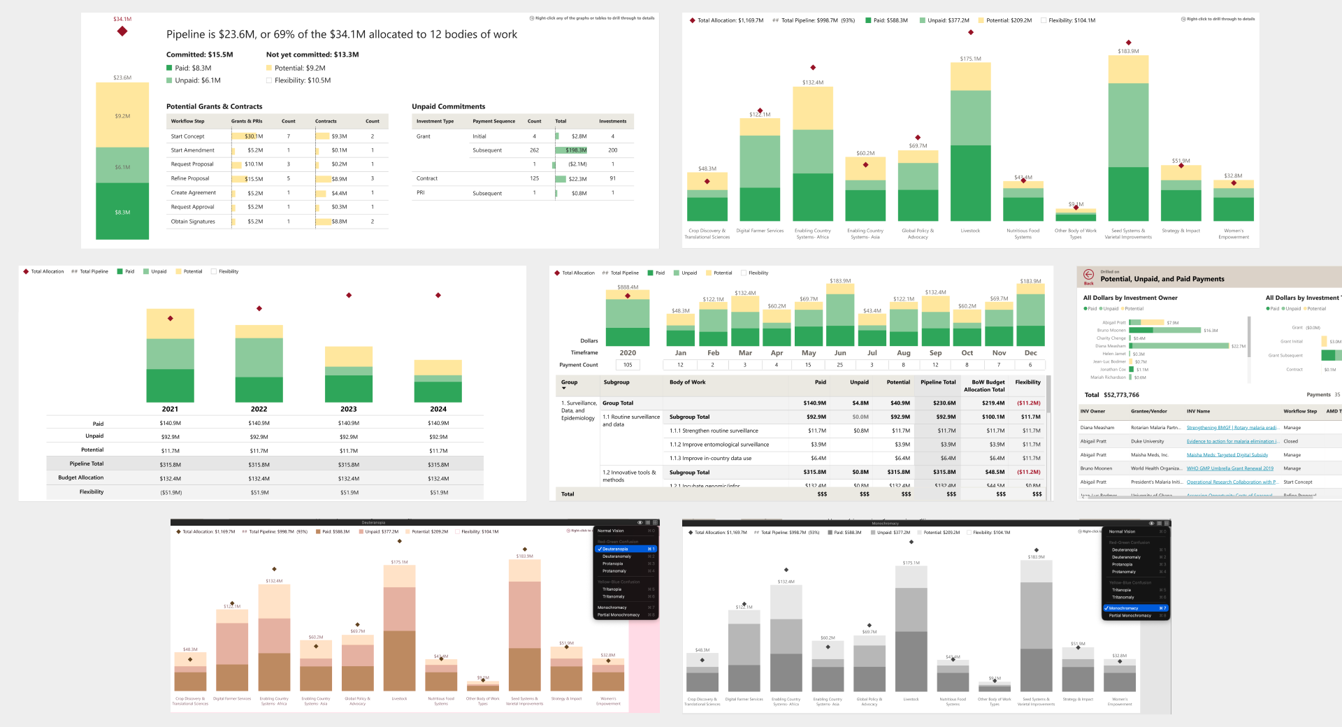
The graphs tested well with the user cohort. The pipeline summary page was particularly positively received, especially the breakdown of potential investments by workflow step, which gave teams visibility into where in-process investments were sitting. One piece of feedback we incorporated: adding numeric labels to the budget allocation diamond markers, so users didn't have to hover to see the amounts. One design intention we couldn't fully realize: some users wanted a gray or dashed visual treatment for the headroom space – the gap between pipeline total and budget allocation – to make that slice more legible at a glance. Power BI constraints made it unachievable, so we let it go and users adapted to looking at the white space and the exact headroom number in a tooltip on hover.
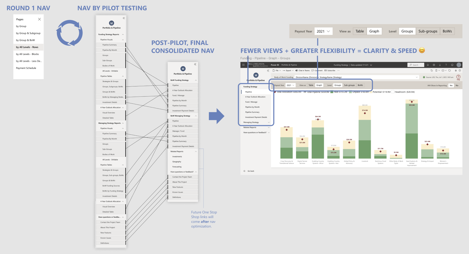
Normally when designing an application, I think about navigation structure early, but I deliberately held off in this project. I wanted prototyping to move quickly and stay focused on content in the first few sprints while we learned more about what resonated with people. For a while, we grouped pages in two simple buckets – tables and graphs. By the end of our iterations, we knew more about how users would move through the information when doing their jobs, so we could land an intuitive navigation structure in a final cleanup sprint. I refined page names to clearly describe the business need each addressed (ex: 4-Year Outlook Allocation) and moved view selection (ex: table versus graph) within the pages alongside filters, following a convention I'd previously established for our design system.
Enterprise BI tools live or die on whether users trust the numbers, but trust in the numbers often starts with words – data labels and definitions. Our round 1 usability testing surfaced a set of terminology problems: the three flavors of "Unpaid" were vague and overcomplicated for a summary view, "Pipeline" meant different things depending on whether early-stage investments were included, and "Flexibility" – the label for budget headroom – was unfamiliar to most users.
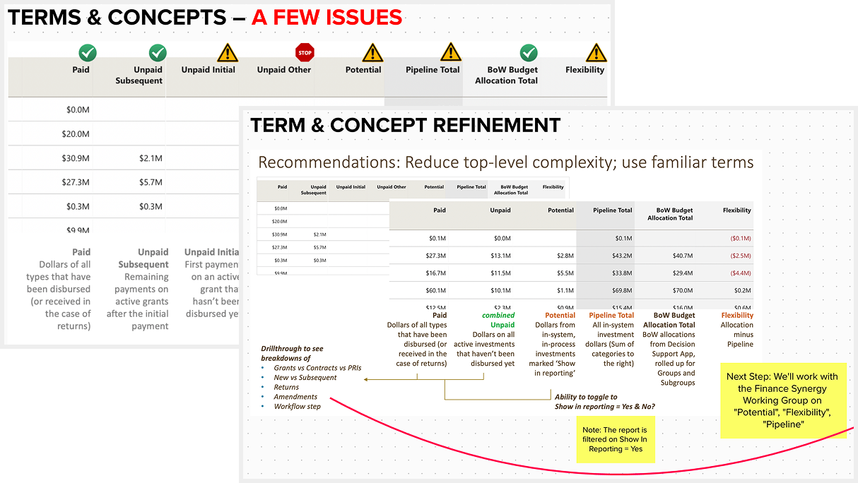
I synthesized findings in Mural and brought specific recommendations to the team and user cohort: consolidate granular categories into simpler groupings, clearly document all definitions, and work with a standing finance committee to align on terms that weren't yet standardized. "Flexibility" vs. "Headroom" was a point of contention among finance leadership, and my user research evidence helped land "Headroom" as the standard.
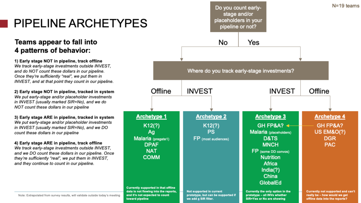
The confusion around what was included in "Pipeline" and "Potential" represented a big adoption risk, so I planned a quick survey to dig deeper and seek clarity. The organization had recently switched from a few legacy grant and contract management systems into one new system called "INVEST" which had limited options for handling early-stage investments and placeholders compared to the old systems.
19 program teams completed the survey to share how they tracked early-stage investments, and this helped me see 4 distinct behavioral archetypes. Two of the archetypes were sufficiently served by our prototype, and one archetype could easily be served with a quick design change which also helped bring awareness to the INVEST feature it related to – reinforcing expectations for how that option could be used in INVEST.
The fourth archetype, however, was harder to address. These teams were tracking early-stage investments in spreadsheets outside INVEST, often as part of their forecasting process.
Forecasting is how teams manage risk and uncertainty across their portfolios, and there were thought to be many different approaches – at the beginning of our project, leadership considered enterprise-level forecasting untouchable in part because the 40+ teams' needs seemed too unique. But after my survey and continued concerns from the "4th archetype" teams, we did another round of interviews to dig deeper on forecasting behaviors.
The interviews revealed just 3 major forecasting patterns across the organization. Reframing the problem from "40 teams with 40 different needs" to "3 patterns worth designing for" gave us the credibility with users and executive leadership to unlock a subsequent phase of work – one that ultimately became the key to getting all teams to adopt the enterprise reports and retire their legacy tools.
Pilot Testing
After about 9 two-week development sprints, all the views and validated data were in place to run a pilot where staff would use the dashboard in their day to day work. They were encouraged to use it alongside or instead of existing tools, work with us on any data discrepancies, and complete an exit survey on their overall experience and readiness to switch.
Across the board, our new dashboard was rated higher for ease of use than teams' legacy tools, and got rave reviews:
“So excited, I feel like I've died and gone to heaven. This is a long time coming, and even if we haven't reached the finish line yet, just wanted to give a shout out for the development of new, user-friendly reports and tools that work for matrixed teams. Thank you!” Deputy Director, Strategy Planning & Management
“I really appreciate how easy it is to use these reports with others on my team and see a lot of value in how they can help others quickly answer questions that previously would have required my help given how clunky our side tools have been.” Financial Planning Analyst
“This is the FIRST time in my 10-year history that I am able to trust that using a ‘manage’ view will show only the funding streams we care about!!! This is HUGE.” Portfolio Officer
Still, a few key pieces of functionality were identified as blockers to retiring certain teams' legacy tools – the forecasting theme persisted, and a need for point-in-time snapshots also surfaced clearly.
“The snapshot functionality and adjustments would make it possible for me to say b'bye to my side tool completely.” Financial Planning Analyst
“Thanks team for taking forward this hot-topic issue [forecasting]! It would be SUCH game-changer to day to day work … This is a true highlight of the year :) thank you!” Portfolio Officer
Outcomes
I knew we'd achieved my goal of creating irresistable dashboards when tool was adopted more quickly than anticipated by an influential division, enabling earlier-than-planned retirement of their well-loved Tableau-based tool. Other teams quickly followed, and the last group of holdouts converted after full forecasting and point-and-time snapshot functionality were finished.
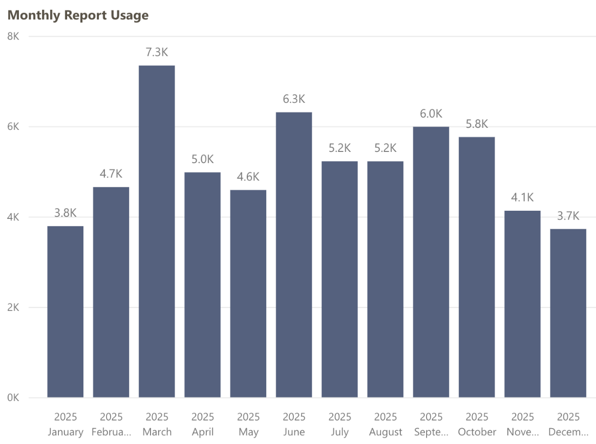
Over 4 years from launch, Portfolio & Pipeline is still used daily by Program and FP&A staff and consistently ranks the #1 most-used "app" in our Power BI tenant, with an average of 173 page views per day.
This report allowed us to consolidate maintenance time and costs that were distributed redundantly across teams, freeing up staff time and resources for higher impact work. Eventually most of the 100+ legacy tools were replaced by this and other enterprise solutions my team and I helped design, enabling retirement of the old data warehouse.
Additionally, we were praised for our inclusive design approach. The cohort method I helped define has been reused on at least 3 other projects, including the subsequent Forecasting phase.
After many successful partnerships and time spent learning from each other over the years, the foundation's finance team continues to practice human-centered ways of working, refining and expanding our dashboards as business and user needs evolve.
 Building a virtual clinic to connect patients & clinicians 24/7
 Empowering women to make informed childbirth decisions